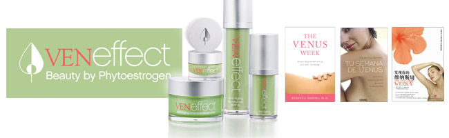
Brand Identity and Packaging
The Situation
• Beauty Booth LLC began in 2006 when two sisters, Dr. Rebecca Booth and Cecil Booth, discovered a mutual interest in enlightening women about the secret beauty of their hormonal cycle and how they can live better throughout their lives in that knowledge.
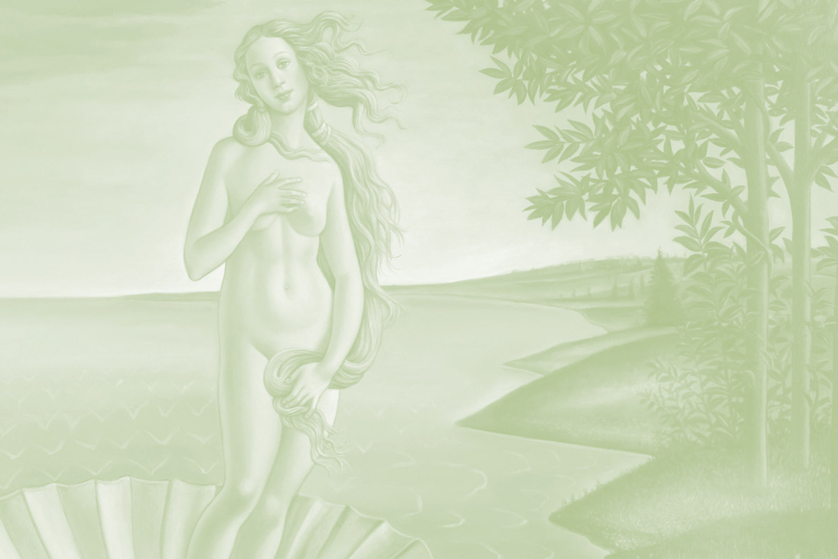
• Their combined vision led to a book, authored by Dr. Booth, “The Venus Week: Discover the Powerful Secret of Your Cycle…at Any Age”, now available in three languages and in many countries
• The book revealed that as her estrogen peaks, a woman feels more attractive, energetic and focused – she has a “glow” and this is called the Venus Effect!
• In spite of the fact that every woman experiences hormonal aging, its effects on skin are largely overlooked. Products to address hormonal aging are practically nonexistent.
• Beauty Booth created a skin care line to address this unanswered need in the marketplace and introduced the first brand dedicated to preserving and restoring The Venus Effect
The Creative Business Idea and Solution
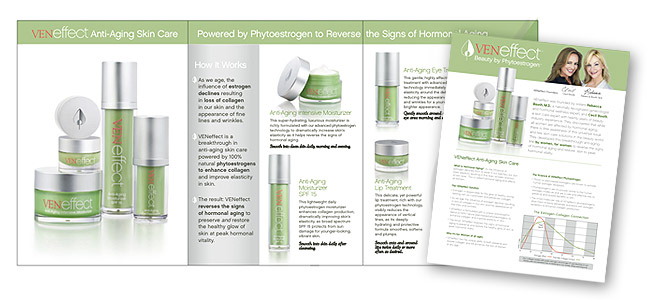
• New brand ID, logo, packaging (four SKUs to launch) and collateral materials were created by AGW to launch the new product line that included SPF moisturizer, intensive moisturizer, eye cream and lip treatment.
Product Brochure
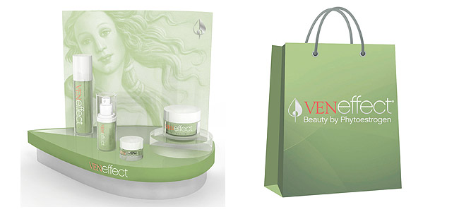
Retail Display and Support
The Results
• There are a total of 5 SKUs offered by this brand now: Anti–Aging Intensive moisturizer, Anti-Aging moisturizer with SPF, eye and lip treatment, Firming Phyto–Lift Serum and two more (cleanser and exfoliant) to launch in Q3- 4 2014.